
Skip to content
TRISOCIALS
← All work

Cannamix

Brand identity · Packaging · WebsiteCase study 02 / 06
Overview
Client
Cannamix
Sector
CBD wellness
Scope
Brand identity, Packaging, Website

A CBD wellness brand built from the mark outward — identity, packaging and e-commerce as one system.

From the caduceus-leaf mark to the last product label, everything Cannamix touches carries the same promise: from leaf to relief.

01 · Challenge

CBD sits between pharmacy and taboo. Cannamix had to read as credible wellness — natural, lab-tested, premium — without a whisper of head-shop.

02 · Research

Trust is the purchase driver. Buyers look for calm, clinical cues wrapped in nature — deep greens, botanical detail, quiet typography.

03 · Strategy

One promise, carried by every surface. From leaf to relief.

The mark fuses leaf and caduceus — nature and medicine in one symbol. Everything else is built outward from it.
04 · Creative directionHow the idea looks, sounds and moves.
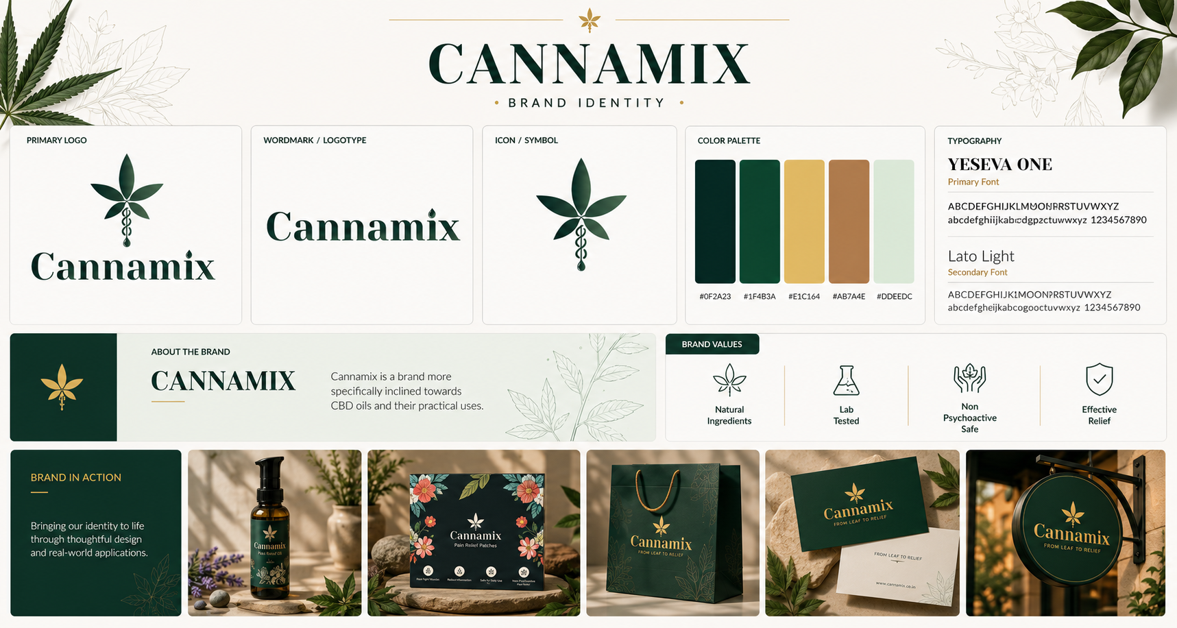
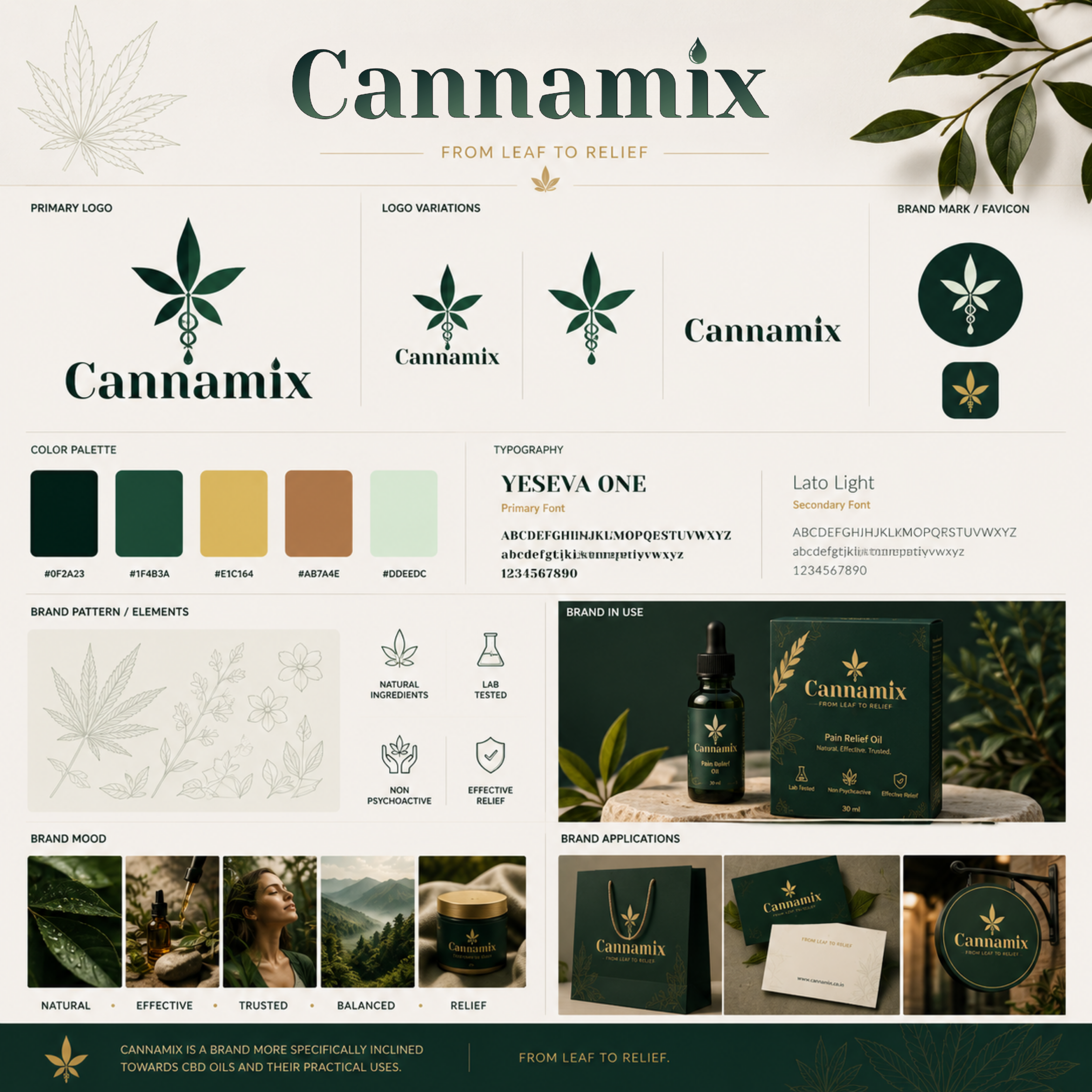
Cannamix brand identity board — logo, variations, palette and applications
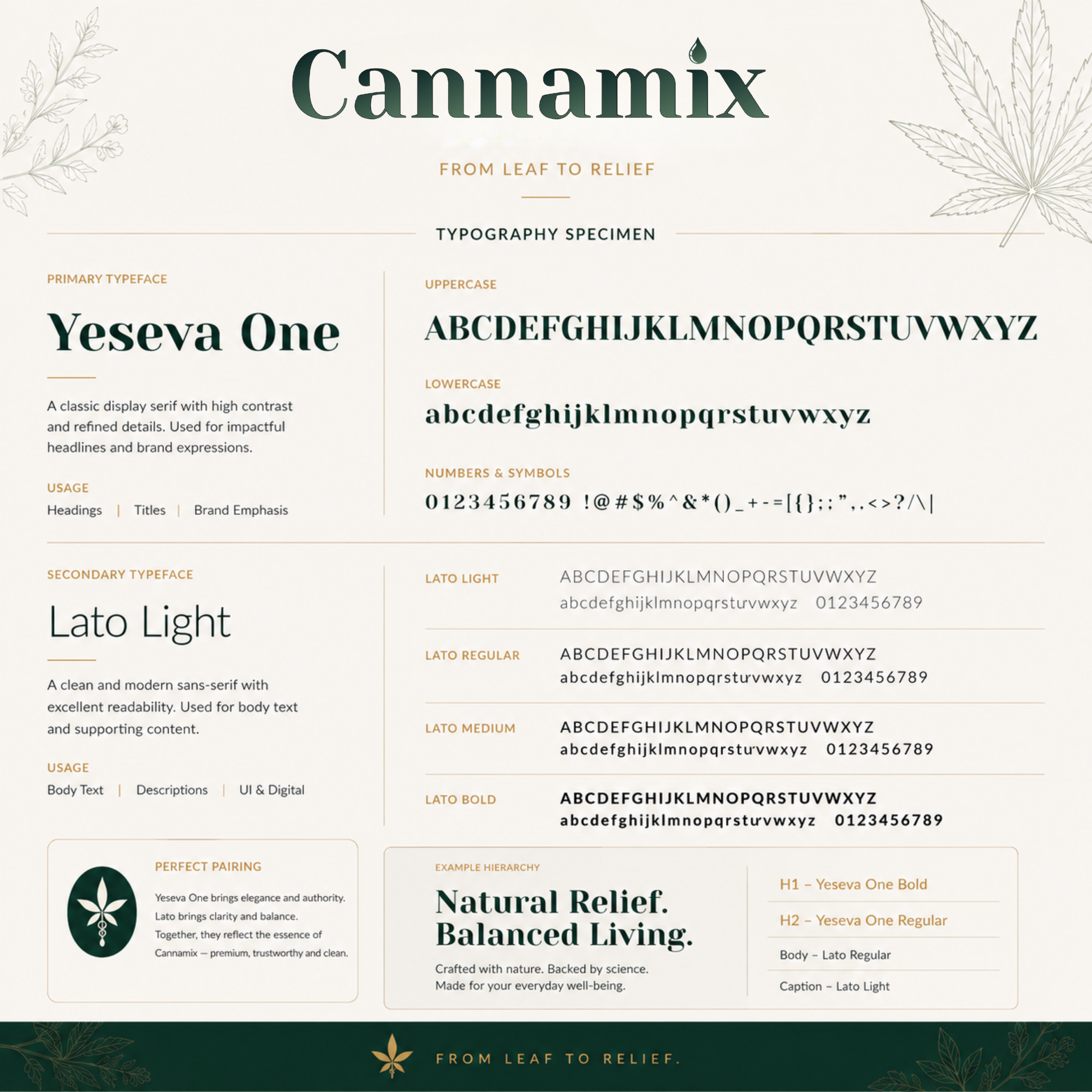
Cannamix typography specimen — Yeseva One and Lato
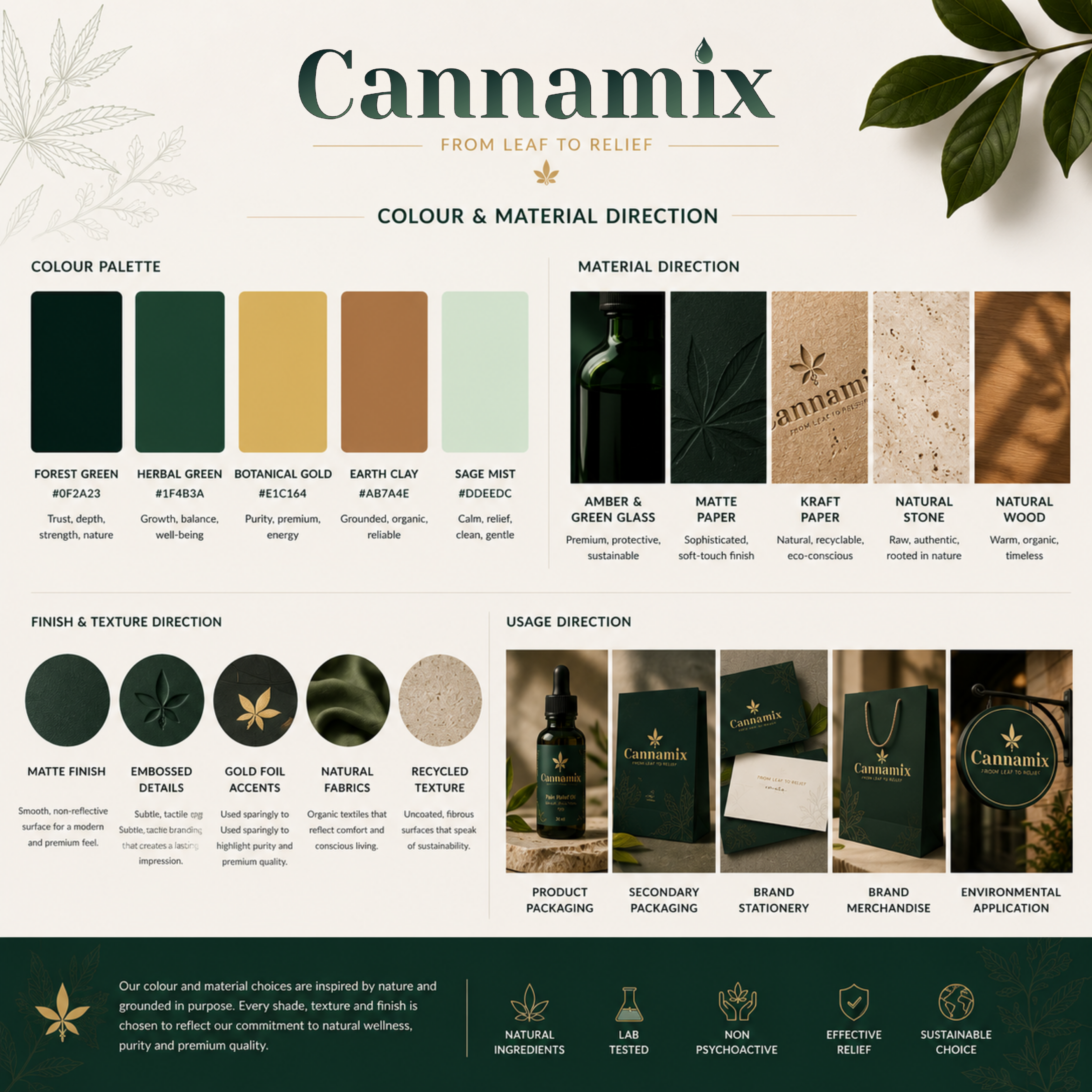
Cannamix colour and material direction — forest greens, botanical gold, kraft and glass
05 · ExecutionThe system, in the world.
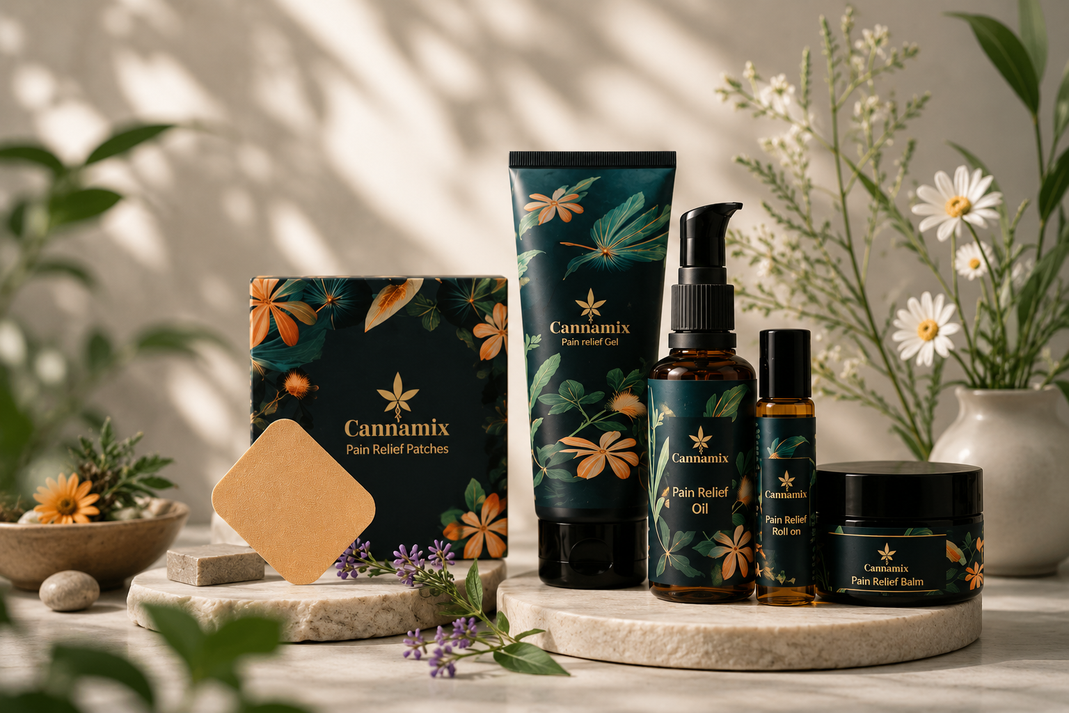
The full Cannamix pain relief range — patches, gel, oil, roll-on and balm
01

Brand identity

Cannamix brand identity system — logo, wordmark, palette and applications
02

Packaging

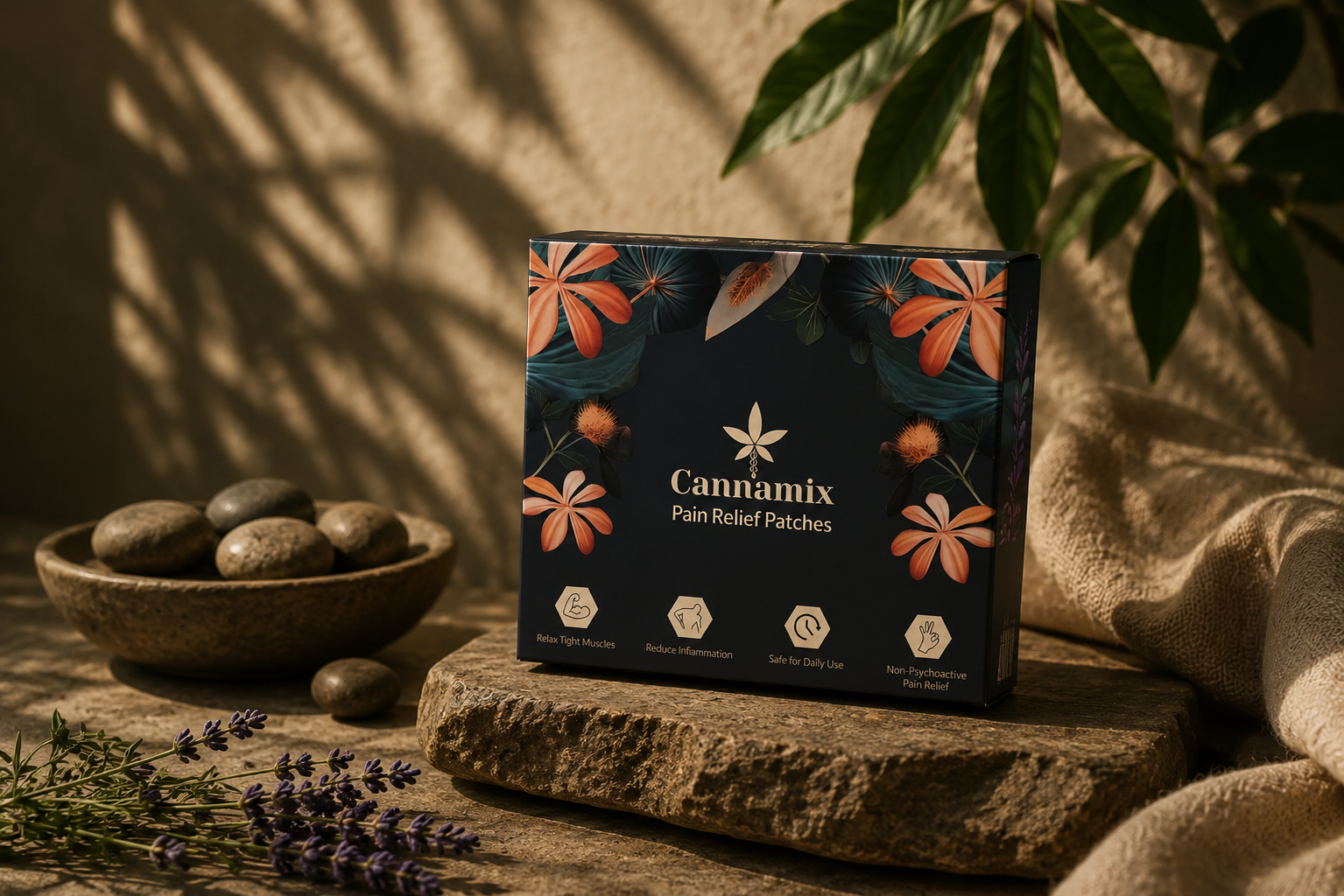
Cannamix pain relief patches box with botanical illustration
03

Website

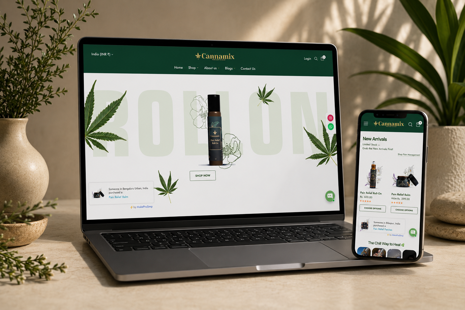
Cannamix e-commerce website on laptop and mobile
06 · Business impact

We don't publish client numbers here. Results are shared in conversation.

Ask us about Cannamix's launch in the room — stated plainly, sourced, never inflated.
Gallery
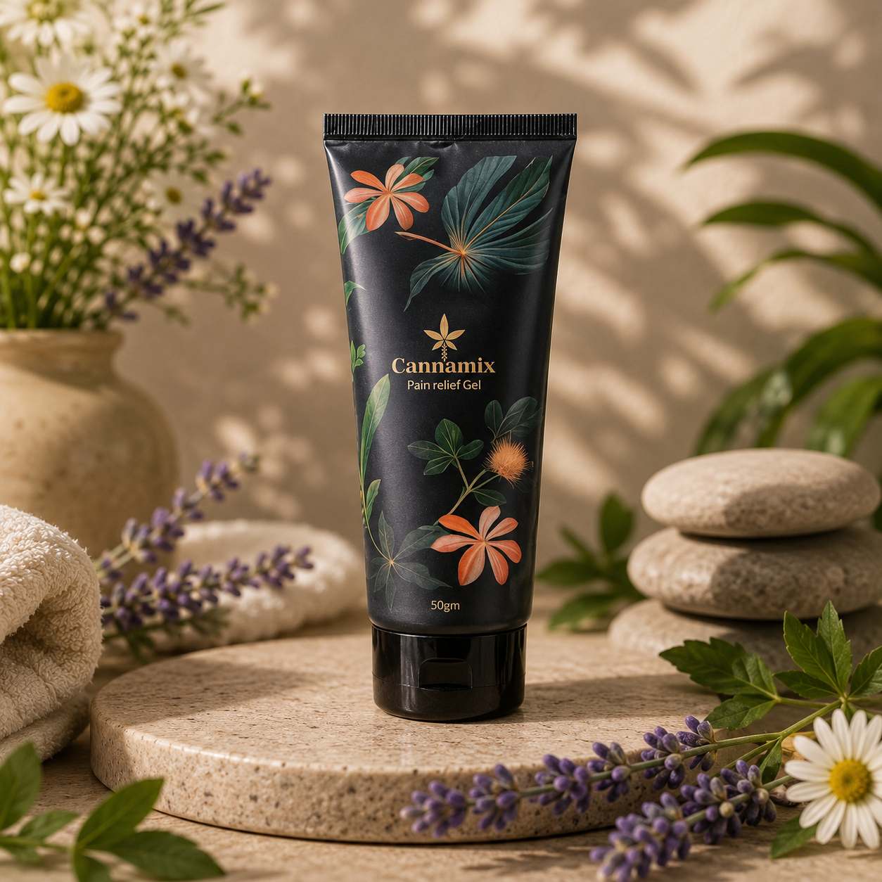
Cannamix pain relief gel tube with botanical print
Cannamix pain relief roll-on in amber glass
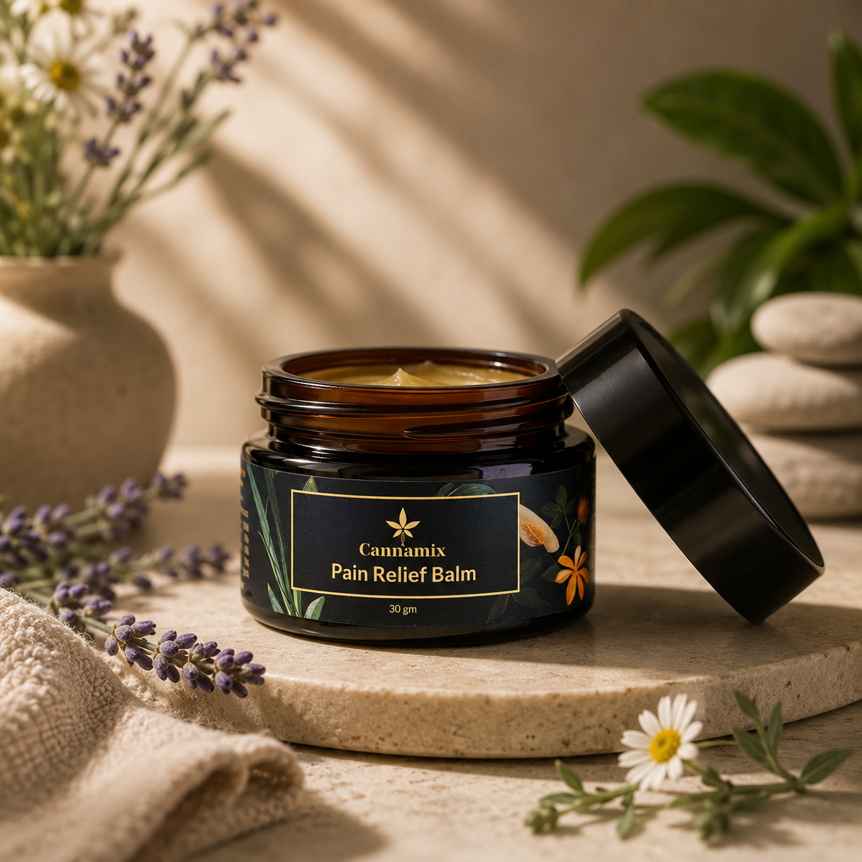
Cannamix pain relief balm jar, open
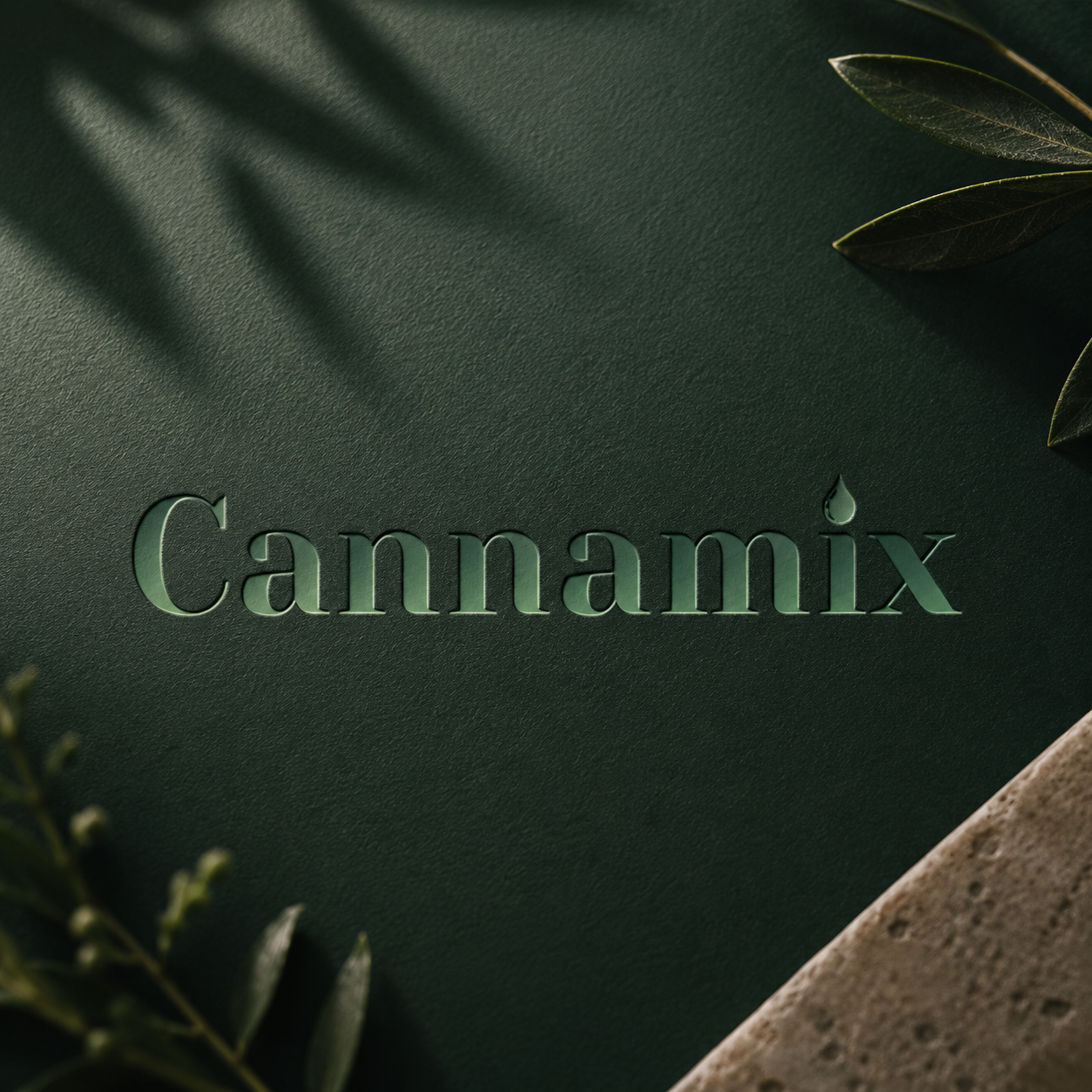
Cannamix wordmark embossed on deep green material
Next case study

SuperFoodVeda

Packaging redesign · Brand refresh