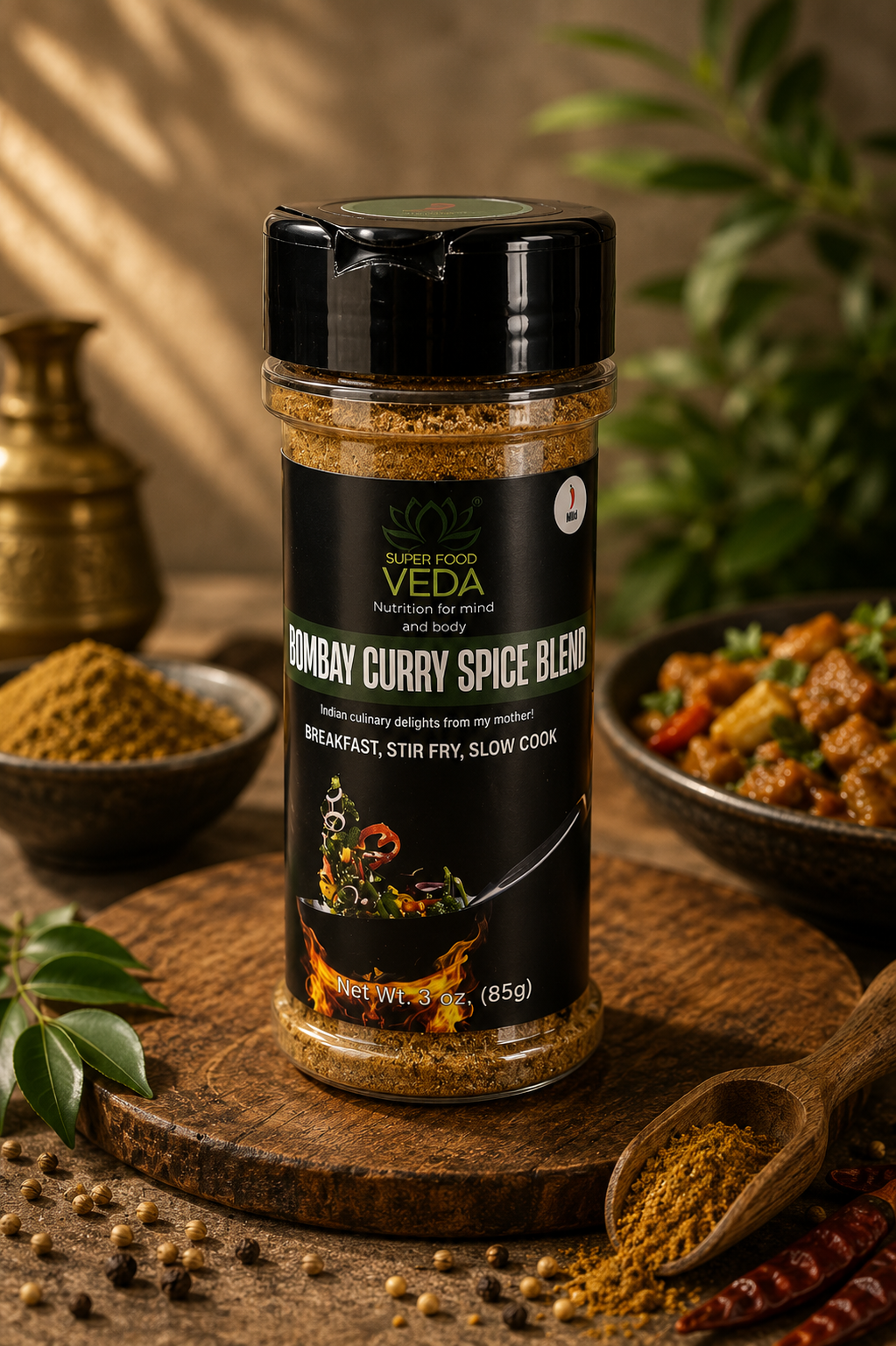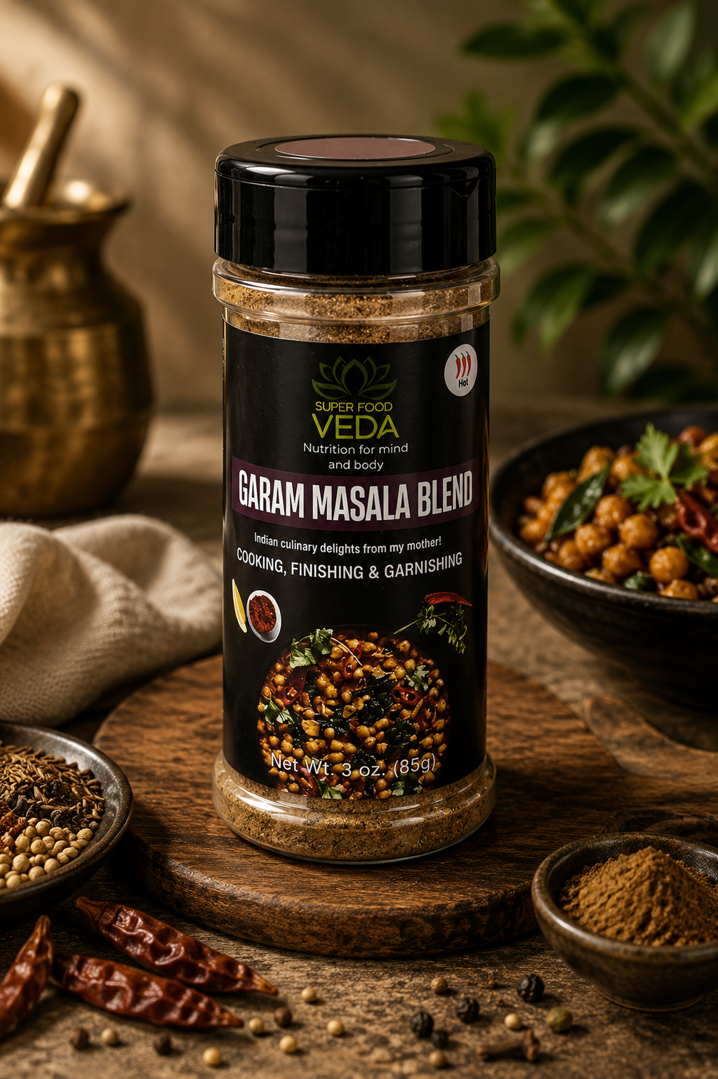
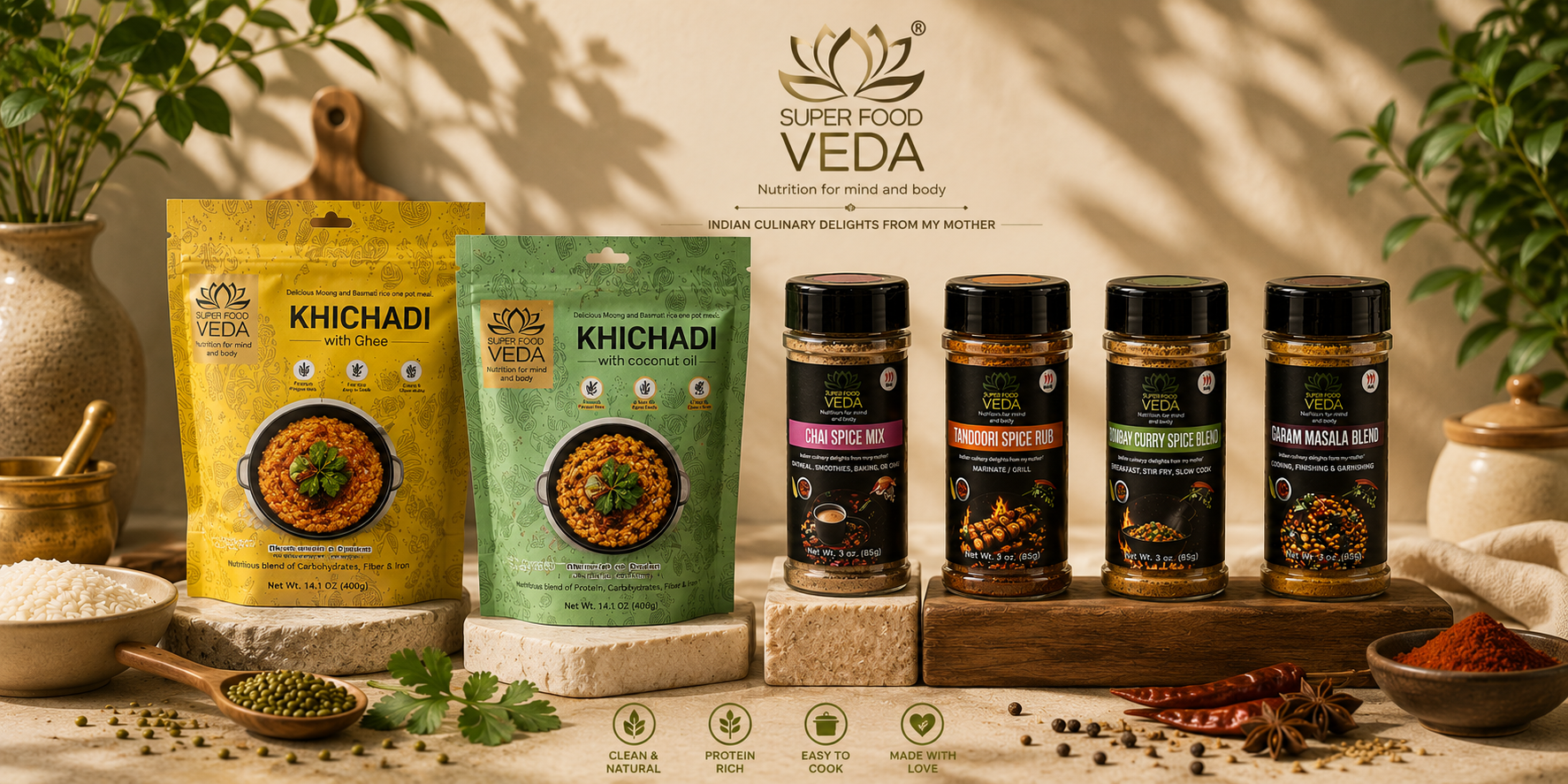
- Client
- SuperFoodVeda
- Sector
- Health & nutrition
- Scope
- Packaging redesign, Brand refresh
The same mother's recipes — finally given shelf presence.
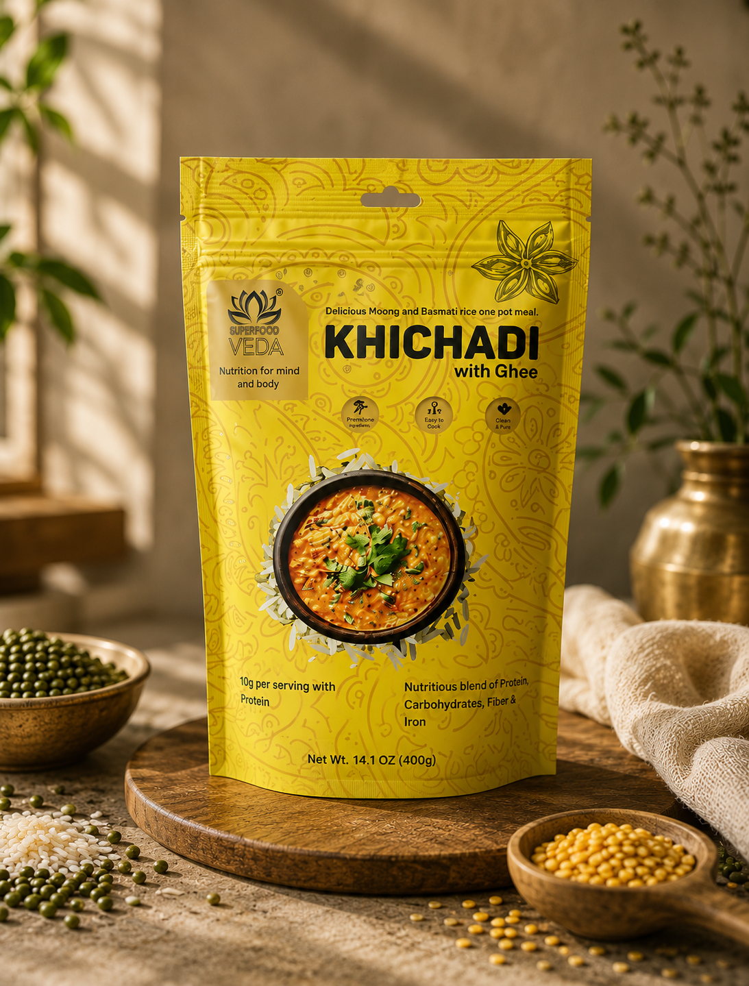
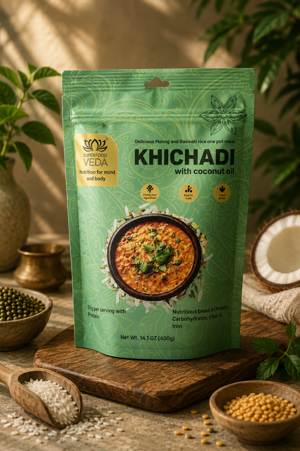
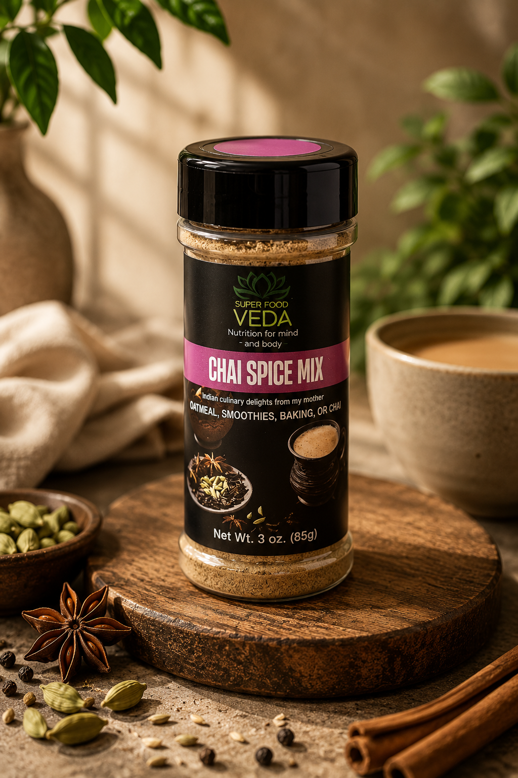
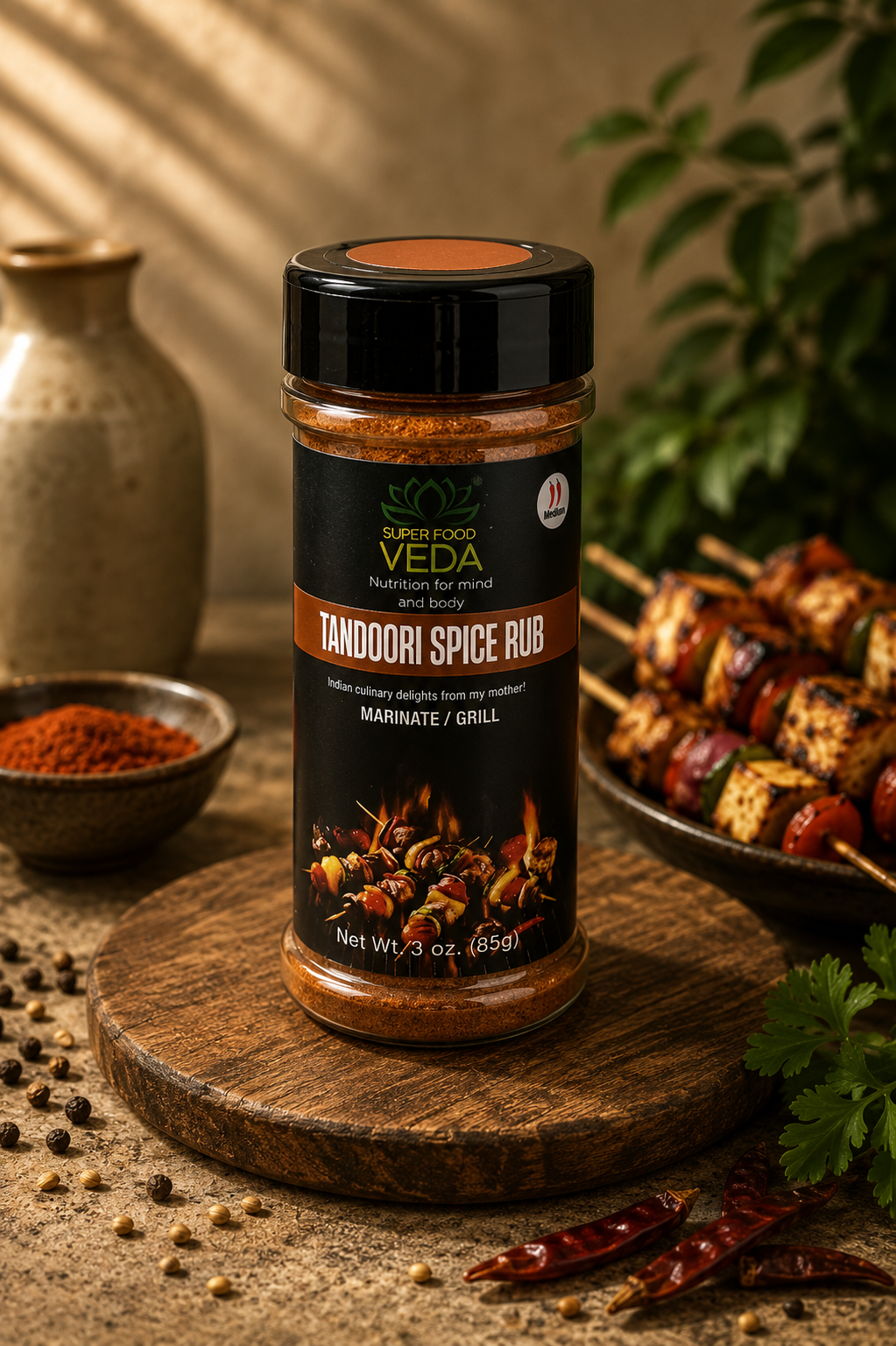
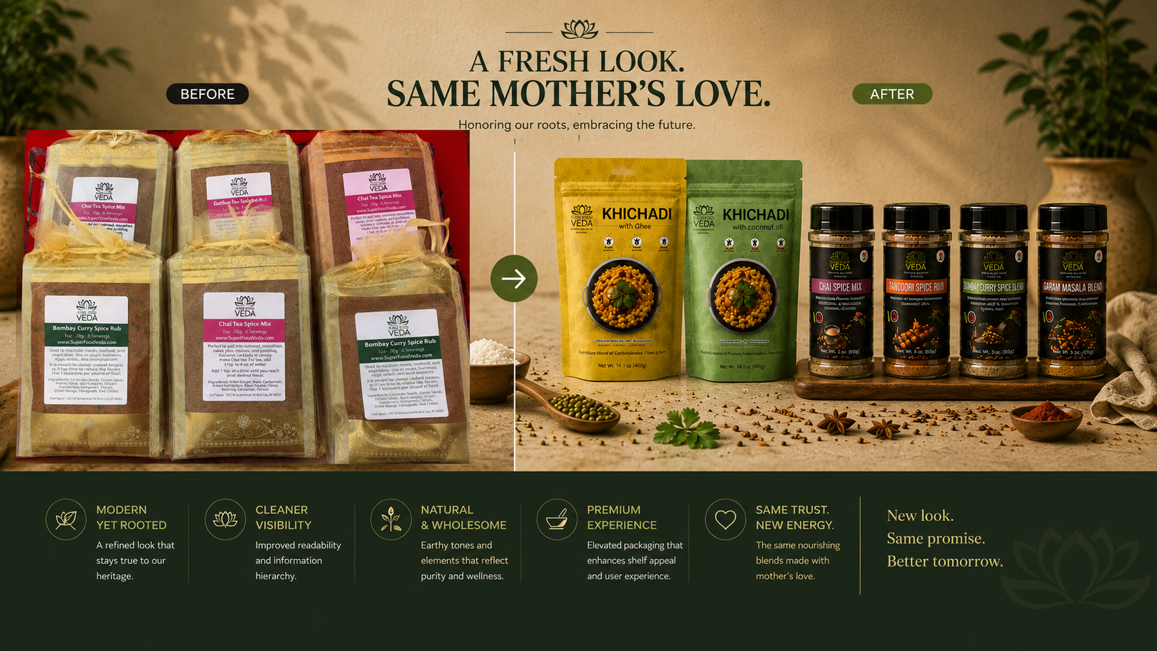
A packaging redesign and brand refresh for an Indian wellness food brand — khichadi meals and spice blends rooted in Ayurvedic tradition, repackaged to compete in modern retail.
A loved product in invisible packaging. Hand-tied pouches and printed labels couldn't carry the brand into retail — or justify its price.
The equity was already there — tradition, honesty, “from my mother”. It needed structure: clear hierarchy, natural cues, premium finish.
Rooted in tradition. Made for today.
Keep the mother's love, replace the packaging language — earthy palette, gold-foil lotus, clean hierarchy that reads at arm's length.
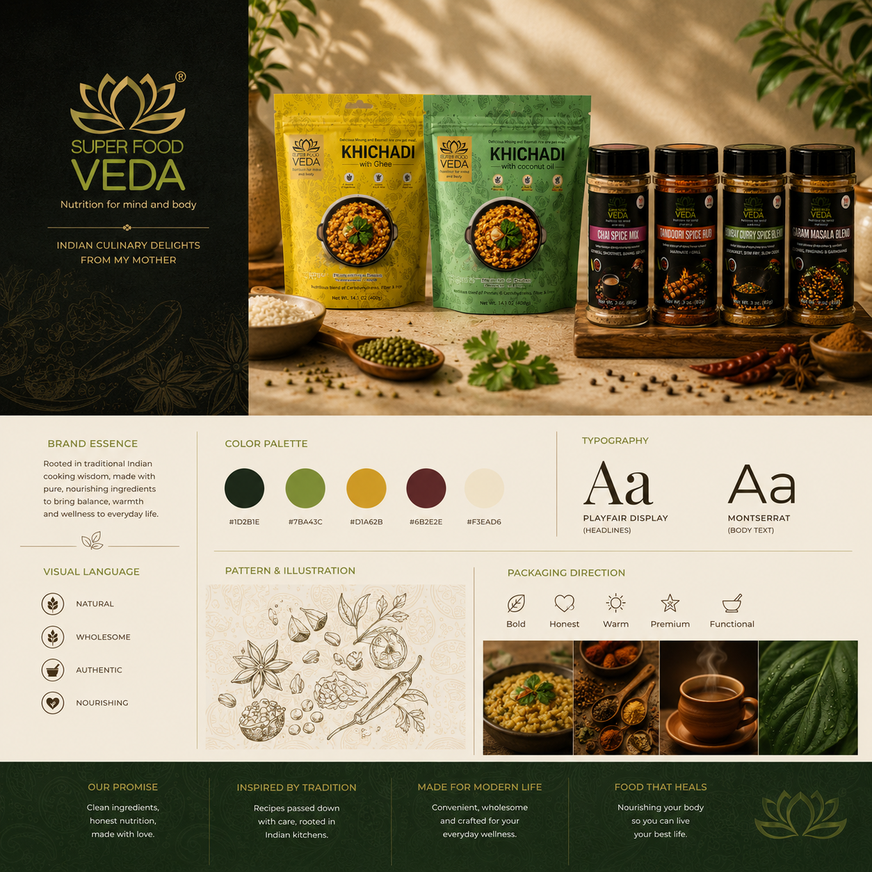
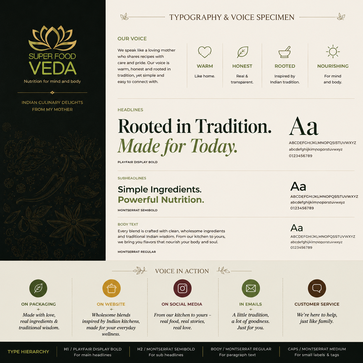
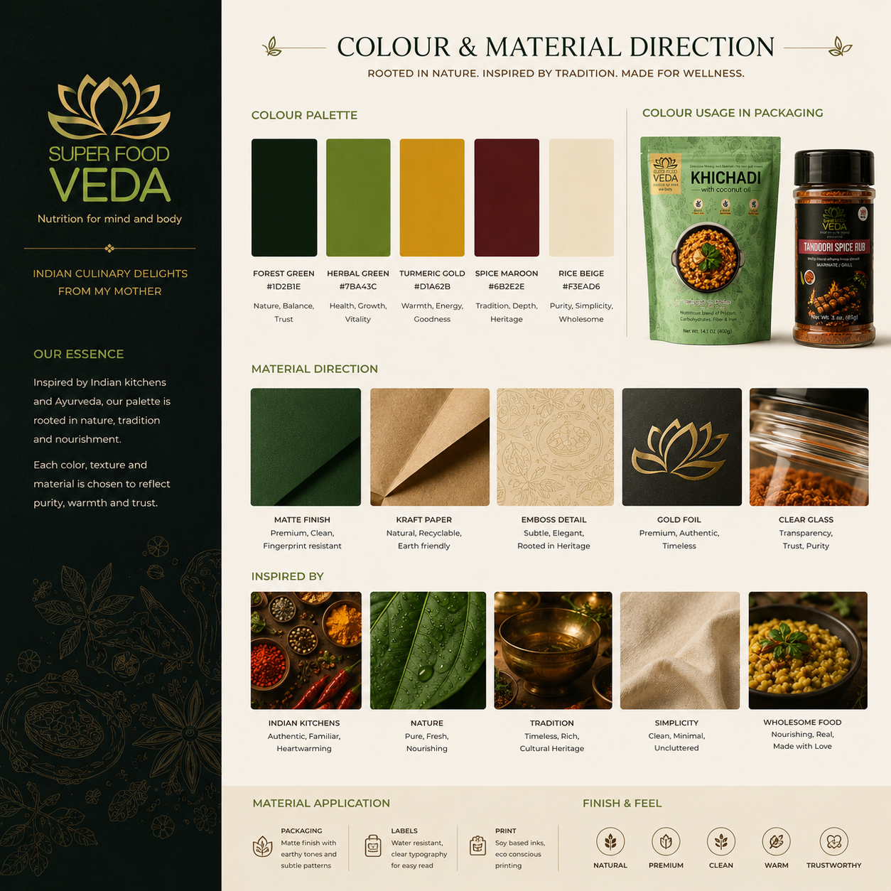
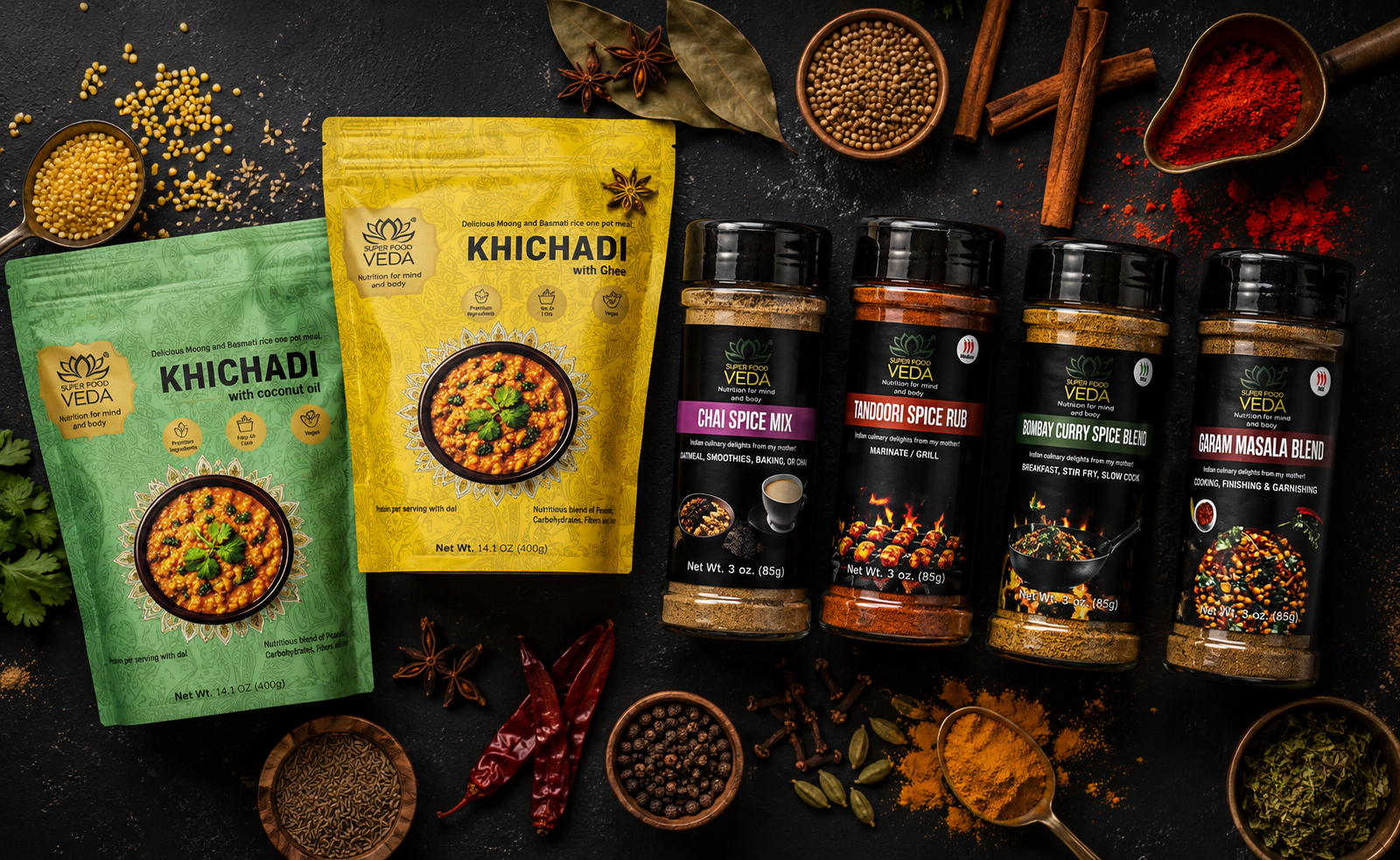
Packaging system
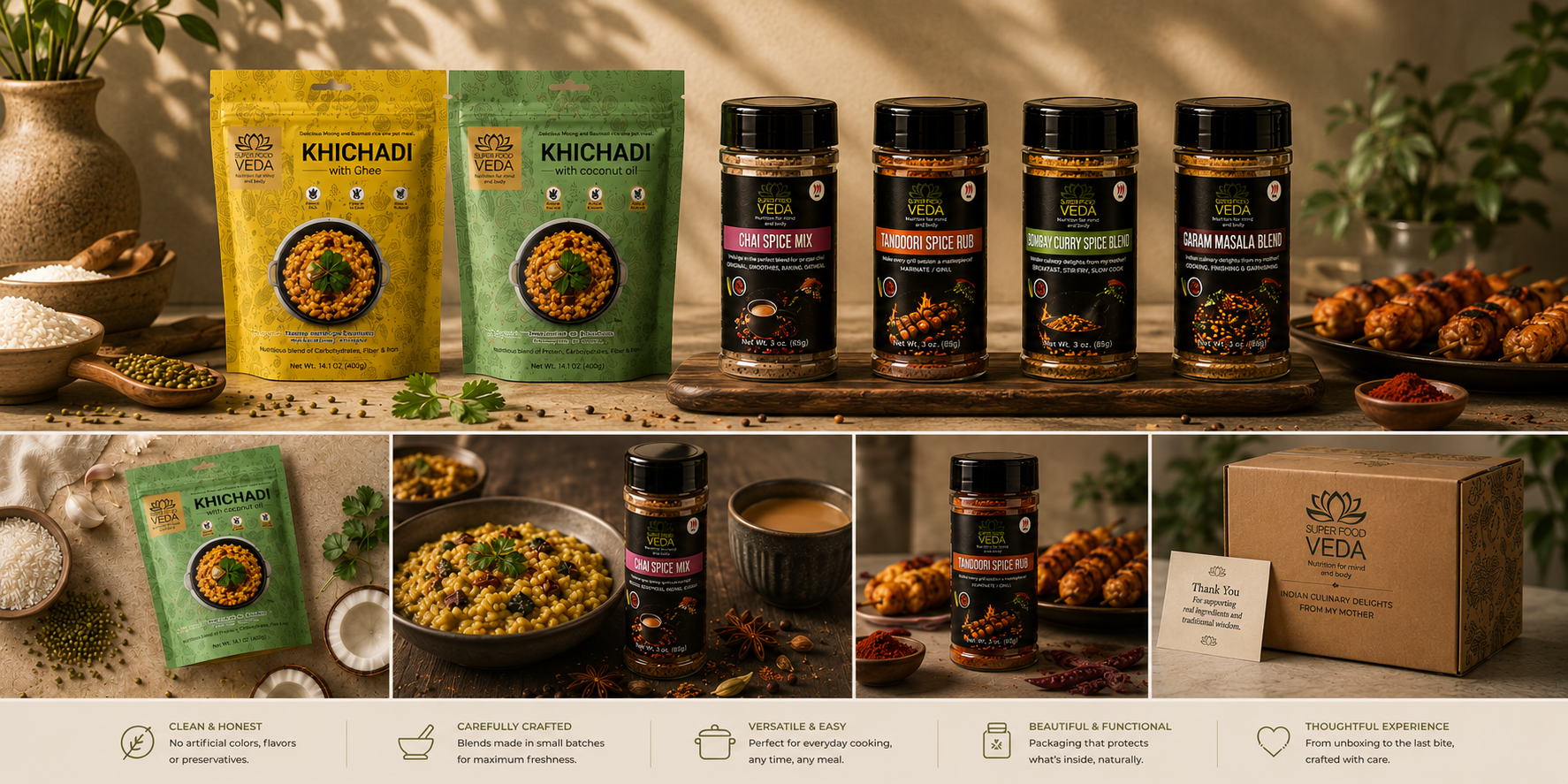
Brand refresh — before & after
We don't publish client numbers here. Results are shared in conversation.
Ask us about SuperFoodVeda's relaunch in the room — stated plainly, sourced, never inflated.